
This is a link to the survey that I sent around to people so that I could find out who would buy my magazine. The powerpoint itself has enough writing on so I don’t think I need to tell you what’s in it. Please could you now click on this link. > Survey responses
Music Magazine


- In what ways does your media product use, develop or challenge forms and conventions of real media products?
My masthead composes of a basic text called myriad pro, which will then be used in the contents title and the double page spread title. I did this to make it unique so that it looks structured and nice for my audience. Within the contents page, I merged the letters in to three stages CO at the top, NTEN in the middle and TS at the bottom, this was placed at the top right corner for the text to unfold underneath.
All audiences tend to aim to read at the top left and finish bottom right. In order for my target audience to admire my work, I placed images in both the top left and the bottom right corners. Typography was used within the text, at the start I initially commenced with pen writing, which mimicked a hand writing style. After changing the background font to grey, I felt that the pink was out of place so I changed it to a darker grey on the contents page so that it appealed to my target audience.
Although I changed the text on the contents page, on the double page spread I kept the handwriting style. The purpose of this was to make it seem like the interviewee seemed like he personally wrote the answers on to the page. My double page spread challenges a form of real media product because it is split in to four columns.
2. How does your media product represent particular social groups?
My magazine will be aimed at a young musician audience who are 15-20 years of age who want to attend gigs and swap music tastes and ideas with other people in order for them to go out and perform. Although, I don’t want my audience to be X Factor freaks who want to be the next Ben Haenow who no-one has heard of since 2014. My magazine particularly talks about one artist (Christian Murphy) but also mentions another artist (Jamie Thompson). They are both 17 & 18 so would attract the same age group. The contents page also includes a band of teenagers.
3. What kind of media institution might distribute your media product and why?
I want my media product to be released by big companies like “The Magazine Printing Company” who will work with individual producers like me, so that it can become popular. I would also want my work to be printed by “The Archant” which is a local company with a wide readership. This will help influence local bands to attend local gigs.
4. Who would be the audience for your media product?
My media product would be for a young audience who aspire to be musicians. Not much has been provided for my audience as they are quite covert musicians. My magazine will help them come out and let their music be heard. A magazine called “Just 17” use to only be read by 13-14-year-old girls who aspired to be like the 17-year-old girls they heard of in the magazines. My magazine will structure a way for my audience to communicate between each other as there are no magazines that will offer the same as my one.
5. How did you attract/address your audience?
I would attract my audience by bringing them together with the list of local gigs which are coming up – with a listing by date and by type. My magazine will be aimed at local musicians until it reaches a national level, at which point it will be region specific. What I could do with my magazine is to ask famous artists and famous publishers who have their own audience, to endorse my publication by having articles in it, at which point that will increased buyer rates.
6. What have you learnt about technologies from the process of constructing this product?
I have learnt a lot from technologies by doing my own research on how to manipulate certain techniques in certain ways. New technology like adobe Photoshop and illustrator has helped me make my magazine attractive and readable for my audience. I was using a canon 1100D with a 18-55mm lens while taking the pictures for my magazine. I learnt how to use settings embedded in the camera such as the shutter speed and aperture to manipulate images to get the perfect picture.
7. Looking back at your preliminary task, what do you feel you have learnt in the progression from it to the full product?
From my preliminary task I learnt to make sure it was audience specific, making sure that the magazine had to relate to who it was aimed at. The preliminary task taught me how to outline the basic needs to a magazine as it was only at an amateur standard. The full task taught me how to challenge the forms and conventions of a media product in order for it to look professional. I definitely learnt to do more research for the magazine which was something I hardly did in my preliminary task. By practising over and over again with Photoshop and Illustrator, it had enabled me to adapt my skills and apply them to my magazine to make it better. I made sure that the setting was correct, for example, I made sure the clothing was suitable, the lighting, the equipment, etc. I ensured to adapt my magazine to cover the untidy parts of the magazine, for example all the cables that connected to the guitar, etc.
Music Timeline 1919 to 2000
Please click on the link in order to download the powerpoint and read it.
I did the timeline starting from the famous jazz artist Louis Armstrong and finished with music transferring onto the internet and enabling illegal downloads.
Preliminary task assessment
-
Full colour printing is expensive so having an online copy would be a cheaper way of selling it. My magazine has a happier sense to sense to it due to the colour, this makes it better than other school magazine which are often quite unimaginative and boring.
-
Mine is a College magazine so it is targeted at a older audience of 16-years and older. The masthead is quite formal; almost like handwriting. I believe this would make it more attractive to my target audience as they are in College/University.
-
I found that through developing my photography skills with a task of taking 500 pictures over the summer holidays, I could have adapted the photo shoot to having an extreme close-up shot of the Bunsen burner while the students are preparing in the background (blurred out). I also would have needed to focus on thinking more about the setting – remove unnecessary items from the shot, blue bucket, lanyards, add aprons, etc.
-
Still in the early stages of developing my media technology knowledge, I used the basics of Adobe Photoshop and Illustrator to complete the magazine. Now, I know that I can apply more techniques to my work in order to make it more professional and attractive.
Film Poster
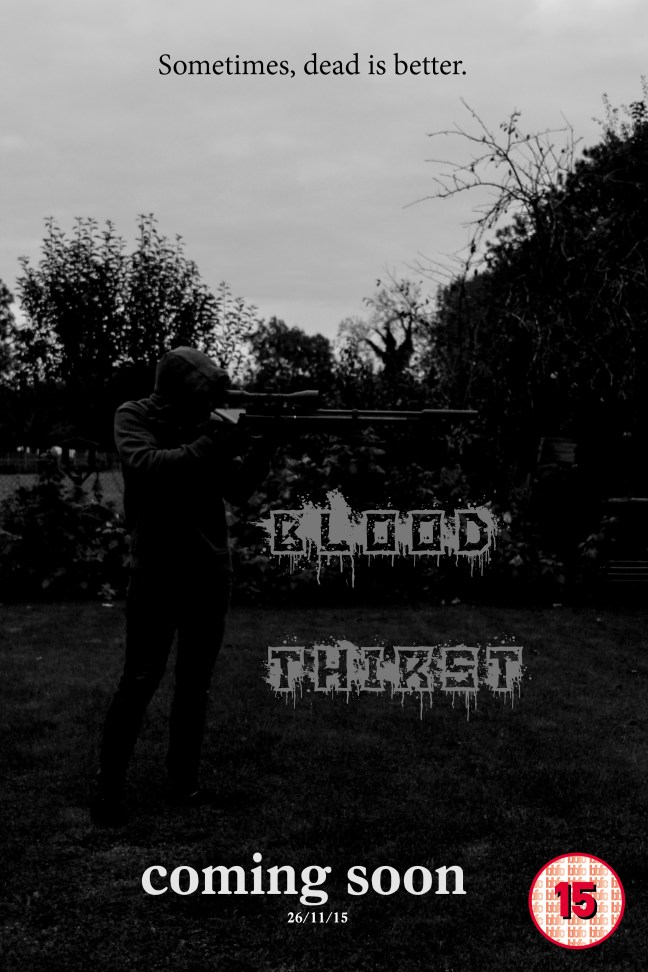
This poster is for a thriller film, the picture is composed of a character holding a rifle to the right of the page. What’s good about the poster is that I wanted my face to be blacked out and I managed to do so with Photoshop and by adjusting the shutter speed on the camera. I tried my best to dress up myself appropriately for the photoshoot, so I wore a grey jumper (Doing research I found that it was proven to be the best colour to hide with in any setting and surrounding), black gloves – to hide the white of my hands, dark blue trousers – which I could then adjust to make them blacker, and black shoes, knowing that the font would be grey.
What I find disappointing about this picture is that you can see the trees in the back and the archery kit on the right. I would like to improve this picture next time by going into a plain field and have a picture taken where I’m covered in grass, wearing a Ghillie suit like a real sniper and have one or possibly two people standing in the distance that I am aiming at.
If I was to use the horizontal lines of the rule of thirds and apply them, I could divide the sky, trees and ground almost like fencing in french (ciel, vie et terre), you don’t want to die – sky, you want to fight your opposition – trees, and you don’t want to get injured and fall to the – ground.
My movie poster includes the main character which is in the focal point of the picture to show his importance, also the genre is shown because the main character is clearly wearing stereotypical killer clothes and is holding a rifle. Things that could be improved is that it’s originally quite hard to see the character so I could lighten the picture a bit. My poster represents people that live in rural areas because of the forest to the right and the field in the background, and also represents violent stereotypes because of the gun and the slogan which is “Sometimes, dead is better”.
The slogan was made just out of random, I didn’t get the idea from anyone or anywhere. I put the slogan at the top because it stood out from the white background and would be easy to read. The purpose of it being short is so that it has a very dramatic impact on the reader. The main title in the middle says ‘Blood Thirst’ with blood dripping from the writing, making it look gory.
A ‘coming soon’ sentence was placed at the bottom with the date underneath in order for it to relate to the fact its a film poster. A BBFC certificate of 15 is placed at the bottom right.
School Magazine
-
Full colour printing is expensive so having an online copy would be a cheaper way of selling it. My magazine has a happier sense to sense to it due to the colour, this makes it better than other school magazine which are often quite unimaginative and boring.
-
Mine is a College magazine so it is targeted at a older audience of 16-years and older. The masthead is quite formal; almost like handwriting. I believe this would make it more attractive to my target audience as they are in College/University.
-
I found that through developing my photography skills with a task of taking 500 pictures over the summer holidays, I could have adapted the photo shoot to having an extreme close-up shot of the Bunsen burner while the students are preparing in the background (blurred out). I also would have needed to focus on thinking more about the setting – remove unnecessary items from the shot, blue bucket, lanyards, add aprons, etc.
-
Still in the early stages of developing my media technology knowledge, I used the basics of Adobe Photoshop and Illustrator to complete the magazine. Now, I know that I can apply more techniques to my work in order to make it more professional and attractive.
Analysing a Music Magazine
Music magazine:
The masthead is quite big taking up almost a quarter of the magazine. Placed at the top it stands out because of the bright white background with just a simple word ‘vibe’ in a grey gold colour which connotes importance and richness. This makes us look straight at it so that we know what the magazine is displaying. The tagline is not shown on the magazine cover which is an issue because taglines are suppose to represent a thought from the magazine. The language used is short and easy to read which is suitable for the teenage and young adult target audience.
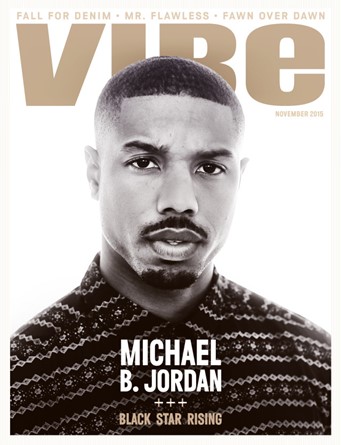 Central image is the most important part to any magazine. This is usually a celebrity or a band who draws in the reader; also a direct mode of address is usually used too. Here the Michael B. Jordan is represented in the rule of thirds, putting four lines through the magazine, usually the media would use this rule to aid in the image making the Michael B. Jordan look central to the image. Michael Jordan is characterised as a stereotypical Londoner wearing a expensive plain Christmas jumper with a moustache and beard with short hair. He could be considered a bit rough with the mean stare he is giving the camera maybe making the viewer feel obliged to buy the magazine but not too mean to make the viewer afraid to buy it.
The colour scheme is very simple, it is made up of 3 main colours, grey gold, white and black. They all contrast with each other to make the most important information (masthead, cover lines, etc.) stand out. It is a commonly used colour scheme in music magazines but here it could signify money and style as well as a music fashion. For example the white background makes everything stand out. You can see that the light is coming from the back (back lighting) this is commonly used in photo shoots where the photographer uses flash cannons from the sides (key lighting and filter lighting) which illuminate the background creating back lighting. If the writing were to be white then the text would blend in with the background as the writing has to be read, but using a black background would blend in with Michael B. Jordan’s head which would change the way the viewer sees the magazine and make them not want to buy it.
The barcode and price is not displayed on the front cover which could mean its either on the side of this magazine or on the back. This could irritate the viewer because they want to see the price, but maybe the company put the barcode at the back to hide the price, making the viewer not realise it. I think that because the magazine is so neat that the barcode and price are place somewhere else to avoid breaking the image.
Main coverline appears at the bottom centre of the magazine, this is to give more information about the main feature/ interview of the magazine although, the information is very minor that it could have two effects – 1st effect could be that the reader gets motivated to see what’s inside – 2nd effect could be that the reader does not get motivated because of the lack of information giving a sense that nothing is in the magazine. The language used suggests that Michael B. Jordan is a rising black star. The plug is similar to the coverline, but is less important as it takes up less space on the cover (very top). The plug gives out extra information on the writing inside which could give the viewer an insight without having to even handle the magazine.
