
Music magazine:
The masthead is quite big taking up almost a quarter of the magazine. Placed at the top it stands out because of the bright white background with just a simple word ‘vibe’ in a grey gold colour which connotes importance and richness. This makes us look straight at it so that we know what the magazine is displaying. The tagline is not shown on the magazine cover which is an issue because taglines are suppose to represent a thought from the magazine. The language used is short and easy to read which is suitable for the teenage and young adult target audience.
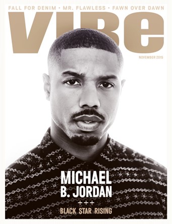 Central image is the most important part to any magazine. This is usually a celebrity or a band who draws in the reader; also a direct mode of address is usually used too. Here the Michael B. Jordan is represented in the rule of thirds, putting four lines through the magazine, usually the media would use this rule to aid in the image making the Michael B. Jordan look central to the image. Michael Jordan is characterised as a stereotypical Londoner wearing a expensive plain Christmas jumper with a moustache and beard with short hair. He could be considered a bit rough with the mean stare he is giving the camera maybe making the viewer feel obliged to buy the magazine but not too mean to make the viewer afraid to buy it.
The colour scheme is very simple, it is made up of 3 main colours, grey gold, white and black. They all contrast with each other to make the most important information (masthead, cover lines, etc.) stand out. It is a commonly used colour scheme in music magazines but here it could signify money and style as well as a music fashion. For example the white background makes everything stand out. You can see that the light is coming from the back (back lighting) this is commonly used in photo shoots where the photographer uses flash cannons from the sides (key lighting and filter lighting) which illuminate the background creating back lighting. If the writing were to be white then the text would blend in with the background as the writing has to be read, but using a black background would blend in with Michael B. Jordan’s head which would change the way the viewer sees the magazine and make them not want to buy it.
The barcode and price is not displayed on the front cover which could mean its either on the side of this magazine or on the back. This could irritate the viewer because they want to see the price, but maybe the company put the barcode at the back to hide the price, making the viewer not realise it. I think that because the magazine is so neat that the barcode and price are place somewhere else to avoid breaking the image.
Main coverline appears at the bottom centre of the magazine, this is to give more information about the main feature/ interview of the magazine although, the information is very minor that it could have two effects – 1st effect could be that the reader gets motivated to see what’s inside – 2nd effect could be that the reader does not get motivated because of the lack of information giving a sense that nothing is in the magazine. The language used suggests that Michael B. Jordan is a rising black star. The plug is similar to the coverline, but is less important as it takes up less space on the cover (very top). The plug gives out extra information on the writing inside which could give the viewer an insight without having to even handle the magazine.
