
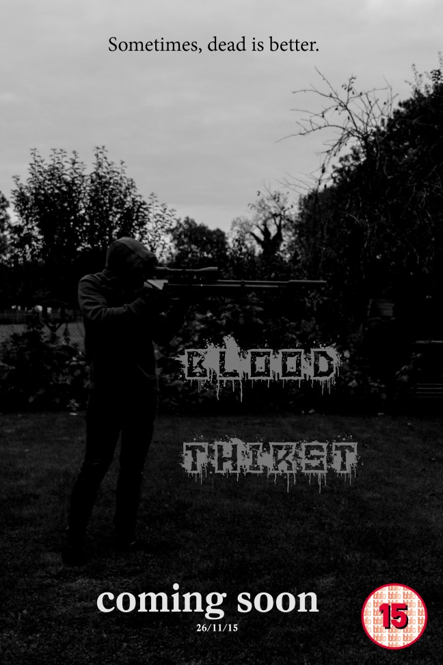
This poster is for a thriller film, the picture is composed of a character holding a rifle to the right of the page. What’s good about the poster is that I wanted my face to be blacked out and I managed to do so with Photoshop and by adjusting the shutter speed on the camera. I tried my best to dress up myself appropriately for the photoshoot, so I wore a grey jumper (Doing research I found that it was proven to be the best colour to hide with in any setting and surrounding), black gloves – to hide the white of my hands, dark blue trousers – which I could then adjust to make them blacker, and black shoes, knowing that the font would be grey.
What I find disappointing about this picture is that you can see the trees in the back and the archery kit on the right. I would like to improve this picture next time by going into a plain field and have a picture taken where I’m covered in grass, wearing a Ghillie suit like a real sniper and have one or possibly two people standing in the distance that I am aiming at.
If I was to use the horizontal lines of the rule of thirds and apply them, I could divide the sky, trees and ground almost like fencing in french (ciel, vie et terre), you don’t want to die – sky, you want to fight your opposition – trees, and you don’t want to get injured and fall to the – ground.
My movie poster includes the main character which is in the focal point of the picture to show his importance, also the genre is shown because the main character is clearly wearing stereotypical killer clothes and is holding a rifle. Things that could be improved is that it’s originally quite hard to see the character so I could lighten the picture a bit. My poster represents people that live in rural areas because of the forest to the right and the field in the background, and also represents violent stereotypes because of the gun and the slogan which is “Sometimes, dead is better”.
The slogan was made just out of random, I didn’t get the idea from anyone or anywhere. I put the slogan at the top because it stood out from the white background and would be easy to read. The purpose of it being short is so that it has a very dramatic impact on the reader. The main title in the middle says ‘Blood Thirst’ with blood dripping from the writing, making it look gory.
A ‘coming soon’ sentence was placed at the bottom with the date underneath in order for it to relate to the fact its a film poster. A BBFC certificate of 15 is placed at the bottom right.
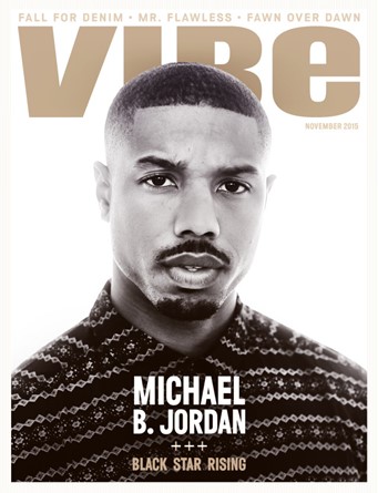 Central image is the most important part to any magazine. This is usually a celebrity or a band who draws in the reader; also a direct mode of address is usually used too. Here the Michael B. Jordan is represented in the rule of thirds, putting four lines through the magazine, usually the media would use this rule to aid in the image making the Michael B. Jordan look central to the image. Michael Jordan is characterised as a stereotypical Londoner wearing a expensive plain Christmas jumper with a moustache and beard with short hair. He could be considered a bit rough with the mean stare he is giving the camera maybe making the viewer feel obliged to buy the magazine but not too mean to make the viewer afraid to buy it.